
Mobile Friendly, Responsive Design and Why it Matters

April 21st was an important event for us in the tech world, Google rolled out their new mobile-friendly initiative, and potentially changed browsing forever. According to recently published statistics, over 50% of web traffic is done via a mobile device, and it is estimated that mobile browsing will overshadow desktop browsing in the near future. Google is requiring ALL websites be mobile friendly or risk loss of rankings or worse.
Now, here’s where it gets a little complicated. Google has a ranking system in place that takes notes on everything every site does. Analytic documentation can show how many times people have clicked your site, who stayed and perused, along with how many people were frustrated and left. This seemingly magical number is called your “Bounce Rate”. Google uses the results of their analytic system to determine how far up their search pile you will land. If you have a solid site that is compatible with all aspects of browsing, Google will reward you with a higher place on the search results. If you have terrible or no mobile compatibility, you will more than likely find yourself buried under your competitors.
What is a “Mirrored” or Mobile Website
This solution requires you maintain and host a completely separate website that is designed to display on smaller screens. Visitors on tablets will also have a poor experience. To fix this you would need to build a third website that caters just to tablets. Having to keep the content on all sites current is an additional expense when you run more than one site simultaneously. On top of which, this outdated method can hurt you in the eyes of the search engines, as they do not approve of this solution.This has always been considered a temporary band-aid or quick fix until a website can be moved to a modern, responsive layout.
What is a Responsive Website, and Why Does it Really Matter?
A responsive website layout actually detects what device it is being viewed on and adjusts accordingly. A Samsung Galaxy tablet and an Apple iPhone 5 are two completely different sized screens. A non-responsive site will look like one giant bar, a roll of paper if you will, that you will have to pinch and zoom all over. These sites will not readjust the margins, text size, borders, or hyperlink sizes. A responsive site will base all of its orientation on what device you are browsing with, registering its screen size, and adjusting the entire format of your website for optimal browsing. Unlike having to maintain a mirrored or duplicate of your site, you only have to have one website designed to grow and shrink to fit whatever device it is being viewed on.
The Big Three:
Reasons Why Your Website Needs to Be Mobile-Friendly
- More Traffic – Your website will have a better chance of increasing traffic volume as a result of improved rankings if the site passes Google’s Mobile-Friendly Test.
- Improve Website “Stickiness” – ie. Keep visitors on your website. Your viewers will be more prone to staying on your site if it is completely cross compatible
- Lowered Costs – With only one responsive site to maintain instead of two or three sites for different devices, your monthly upkeep cost will stay low.
Is My Website Mobile-Friendly?
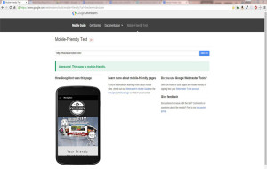 Google provides a free tool to check to see if your website is mobile friendly. Click the link below and enter your website URL (https://YOURBUSINESSNAME.com). Google will review your site and tell you if your website is mobile friendly!
But What Happens If My Site Is NOT Mobile Friendly???
If your site is not mobile friendly, it is recommended that you plan to either retrofit your existing site with the “Mirrored” mobile website solution OR use this opportunity to get a website makeover. In addition to being mobile friendly – a current, modern website will improve your visitor’s experience and provide an easy way for you to update and maintain your website yourself.


